Thread #462332 | Image & Video Expansion | Click to Play

File: FullTimeline.jpg (3 MB)
3 MB JPG
Babe, wake up. The newest downgrade just dropped.
11 RepliesView Thread
 Showing all 11 replies.
>>
>>
>>
>>
>>

>>
>>
>>462362
you know there is a reason why regular car dashboards and formular one race car cockpits have different interfaces?
no need to claim superiority of one if they simply serve different user bases with different expertise and demands...
>>
>>462367
yeah that instant menu and search field able to show program titles ("firefox") / generic titles ("(web browser)") / 1 sentence descriptions and sorting applications by their usage frequency is just like an f1 racecar it's too extreme
it's obvious that the gui needs to look like a bowl of candies of corporate branding and sort of like videogame with acrylic glass jellyfish animations that drop dozens of frames slowly rendered in a google chrome instance or the special needs office worker won't be able to populate the sprint velocity excel97.exe spreadsheet and the GUI designers will die
>>
File: a1e7c2f803ae6b1829c5e2162f185ca6.jpg (520.4 KB)

520.4 KB JPG
>>462368
where i'm getting is that there is a lot of fluff these days that gets in the way of how straight to the point and technically efficient the computer gui could be
windows gui hasn't substantially improved since 2009 but they have time for this bs
>>
>>
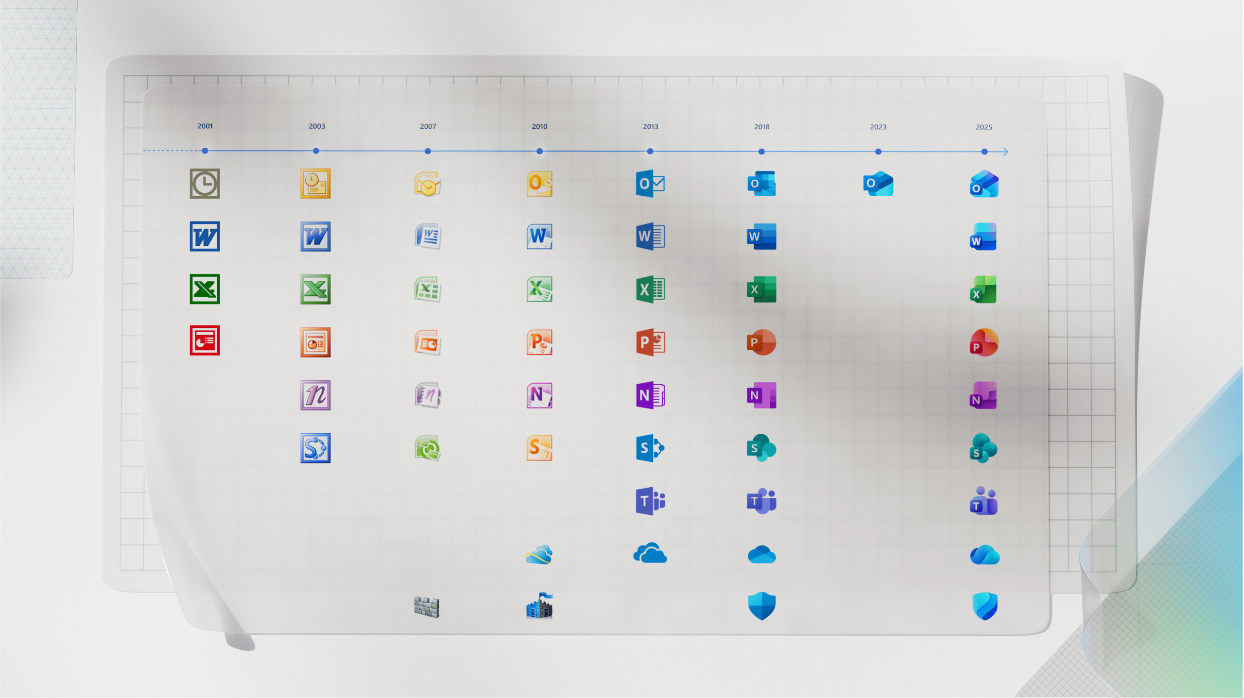
>>462338
'03 is just '01 with a gradient
and '07 looks better than '10
also '18 is at least a improvement on '13 which is the laziest of them all. I wont die on the hill of 2018 design is good' but I will die on 2013 was the worst design.