Thread #7860764 | Image & Video Expansion | Click to Play

File: image.jpg (515.9 KB)

515.9 KB JPG
Why is it impossible to find good color and value resources
Every single recommended resource I've looked into turned out to be either yet another light resource, or a physical paint mixing resource, when all I want is to understand how to put together pleasing and cohesive color palettes in a digital painting
40 RepliesView Thread
 Showing all 40 replies.
>>
>>
>>7860776
From what I see those are still the very basics covered in most light resources
What I'm looking for is
>how to chose a nice local color (in a digital color picker) for each object so the scene looks harmonious
>how many steps to take while making them lighter/darker toward the highlight/in shadow
>how much saturation to add/take away and how much to shift the hue (depending on season, time of day, mood)
>how to make sure the values work for individual objects but also the whole scene
>ranges of saturation and value to stay in, sudden changes to avoid
>when to illustrate detail and when to allow it to disappear and how
>with examples of how it's supposed to look right and why it looks off when not done that way
>etc
>>
>>7860807
I think that's mostly it as far as guides go desu.
After that you have to figure it on your own, try copying and emulating art/photos you like and try to analyze how they do those things.
Most of these things are already in stylization instead of fundies so there's no clear answer.
>>
>>
>>
File: 3992.jpg (403.1 KB)

403.1 KB JPG
>>7860816
There should still be some sort of agreed upon conventions of what works best, like how music has established chord progressions that sound good even though you're free to play however you want
Pic related is still technically following all the rules of light and color theory, but the ranges being out of whack makes it look like even more shit than before, there should be objective guidelines on how to get it back on track
>>

>>
File: file.png (1.8 MB)
1.8 MB PNG
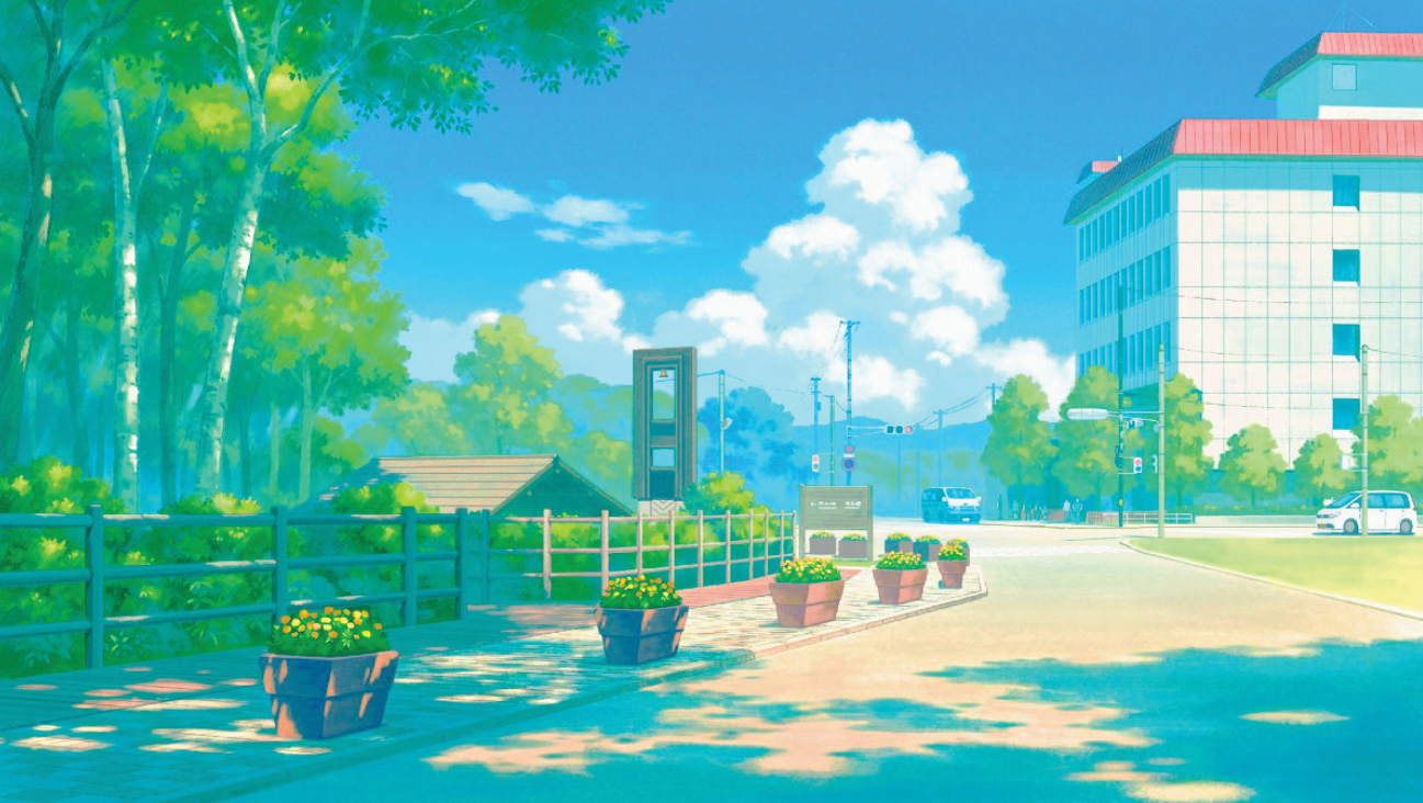
A lot of what people call color theory is just learning how light interacts with materials and surfaces (seriously once you learn this beginners gawk and think you're a color god thinking you're pulling these colors out of your ass when its just basic lighting) and knowing your color values well enough to keep their luminosity within their respective value ranges. If you have shit value control, no amount of color theory will save your art, your art will just look like a dog ate a pack of crayons and ate it.
>>7860831
This is a really good example of how creating a large gap between your lightest and darkest values creates an overblown effect and an example of how bad value control can fuck up colors that look good in theory. If you tightened the value ranges up and brought your darks closer to your highlights in value, this would be more of a brighter nostalgic summer scene, but also a value range that isn't typical of a show like pokemon.
>>
>>
>>
>>7860764
I struggled with this forever until I actually bought a set of gouache primary colors and started painting and color matching. It all just suddenly makes sense. Im guessing the vast majority of good background artists are pretty skilled and experienced with traditional painting.
>>
>>7860831
There is, at least in the industry. It's why a lot of professional illustrations can tend to look similar since there are usually pipelines and creative directors people adhere to that will remind them of these principles. Specific colors, values, etc to indicate moods, settings, etc. Whereas you're a lot more likely to see amateurs freestyle shit, and there are a lot more amateurs than there are professionals.
>>
>>

>>
>>7860996
nice, how and where did you did this, CSP doesnt not help me.
I really like the final result, beats the original or my edit, i really DONT like how overly contrasty and bright anime backgrounds are right now
>>
>>7860764
>digital
>bother about color theory.
Color theory is just a sumary of what is good to minimalize the amount of paint used. With digital, just learn some basic techniques and experiment with color to find your own way.
>>
>>
>>
>>
File: A93E12BB-185F-4330-A226-4BECA07F41FD.jpg (197.2 KB)

197.2 KB JPG
>>7860764
I like to save images with nice colors, then open them in csp. I try to guess what color a certain area is, then I color pick it and see how close I was.
One thing I’ve noticed is that a lot of artists don’t actually use too many colors, they just play with the values and saturation more so.
>>
>>7860764
>yet another light resource, or a physical paint mixing resource
coz thats what it is
>when all I want is to understand how to put together pleasing and cohesive color palettes in a digital painting
just do what you like there is no method to this
and if someone claims that there is a way to make "harmonious" colors or something they are bullshitting
top tier color scientists, neurologists, psychologists, etc have no idea how any of this works and they get paid a lot to research this shit by the marketing industry
>>
>>7866329
>hurr durr nobody knows
name one (1) "pleasing and cohesive color palette" that goes against even surface level color theory
spoilers: you can't because you're a dumb nigger. coping with your abysmal, melanin-burdened IQ
>top tier color scientists, neurologists, psychologists, etc have no idea how any of this works and they get paid a lot to research this shit by the marketing industry
>no idea how any of this works
must be why they're not paid to actually produce imagery for the marketing industry, huh? really activates my nougats
I wonder if there are people paid to actually produce these pleasing palettes and marketing imagery, maybe they would know and teach other people how to do it?
>>
>>7866336
>>hurr durr nobody knows
nobody knows what? is there something to know in the 1st place? colors in nature have no obligation to make sense or have any structure to them for humans while our vision systems job is to be good at fruit picking, colors out of nature like in cities are determined by economics and technology edison did not consult a color theorist when making a light-bulb kings maybe he consulted a color scientist to figure out if his light bults were white bright enough or not but no color scientists and queens did not know any of this shit back in the medieval times and just chose the most expensive to produce and upkeep colors they could find (blue, violet, red) to display power to peasantry and competing elites.
>name one (1) "pleasing and cohesive color palette" that goes against even surface level color theory
https://www.digitaltrends.com/photography/pantone-448-c-ugliest-color/
"If art history is any indicator, it may have already been a much more popular color — and far less ugly — than we consider it now. The Hyperallergic blog has an interesting read on how some of the greatest works of art, including Leonardo da Vinci’s “Mona Lisa,” were created with close relatives of Pantone 448 C."
>wonder if there are people paid to actually produce these pleasing palettes and marketing imagery, maybe they would know and teach other people how to do it?
They are bullshitters and grifters there is 0 scientific basis for anything they say its mostly based on hearsay and outdated memes and all sorts of crap from god knows where. If you wanna make living by being a bullshitter and a grifter there lots of well paying career options for you marketing & design, banking, politics.
>>
>>
>>
>>7865172
Nah. It's the same reason CGI has gotten shittier despite technology advancing. It's not a matter of not being able to execute, it's because suits demand things to be done within a timeline and for money to be used "efficiently". This world is ran by soulless unimaginative bastards who only care about a return. It's why when you have a film where the main focus is actual artistry or passion projects, people really appreciate it.
>>
>>
>>
File: image.jpg (362.4 KB)

362.4 KB JPG
>>7866382
I'll use a game example since I have indie examples and I can track them with the same subject over decades
>Harvest Moon (1997)
>not the biggest fan of the game but it has a very nice earthy color palette that's easy on the eyes and truthfully conveys the feeling of summer
>the grass is dry, the earth is dirty, the water is deep blue, comes together nicely
>Stardew Valley (2016)
>one of my favorite games ever but the color palette is nearing the threshold of pleasing, it's overly saturated with unnatural hues
>the grass is glowing, the bushes are too blue, the water is teal
>Piece of Shitia (estimated 2026 release)
>genuine dogshit color palette that's hard to look at and fails to convey anything
>the grass and trees are an electric glowing green, the bushes are outright blue, the dirt is closer to pink than any real dirt color, feels like the artists weren't even concerned with creating a mood and just went for the most eye-grabbing colors possible
>>

>>
>>7866371
what do oyu mean? my point was that neither nature or man made things follows any of these color theory "pleasant harmonics aristotle and goethe said so" rules
>>7866387
>i like these color combos and i dont like these other ones
thats it. that all you ever needed to do.
read this if you need more convincing
https://www.handprint.com/HP/WCL/color18b.html#symbolism
>>
>>
>>7866433
>what do oyu mean? my point was that neither nature or man made things follows any of these color theory "pleasant harmonics aristotle and goethe said so" rules
You still don't get it, the rules don't exist in nature but in people
>>
>>
File: image_2026-01-26_200827323.png (1.2 MB)

1.2 MB PNG
>>7866433
>>7867750
NTA but you're asking to prove a negative which isn't really possible. Can you show a natural scenario in which color theory isn't applicable?
Color theory isn't something a bunch of artists made up for the hell of it, it describes a natural phenomenon (that being our perception of color and how those colors interact with one another)
>>
>>
>>
>>7867750
That's how humans work, green isn't soothing because green is inherently soothing, but because humans spent millennia watching green nature and have it inbuilt in their DNA now, as long as you're drawing for a human audience you can make use of those preferences and treat them as rules of color