Thread #2022126 | Image & Video Expansion | Click to Play

File: NL-UK-USA-AUS-traffic-sign-comparison.jpg (346.1 KB)

346.1 KB JPG
Road signs. What do you think of them? Which country does them the best? Would you change anything in the Vienna Convention on Road Signs and Signals?
274 RepliesView Thread
 Showing all 274 replies.
>>
>>
>>2022126
>What do you think of them?
That's like asking "what do you think of the metric system" or "what do you think of binary", it's a way to convey information to drivers quicker than writing. I think most are distinct enough that you can recognize without mixing them up.
>Which country does them the best?
Any following the Vienna conventiondoes fine (because standard is better than perfect), but I would argue to not have writing in the signs, because again, it needs to be quick and easy to know the meaning, and visual information gets processed quicker than writing.
>Would you change anything in the Vienna Convention on Road Signs and Signals?
No writing allowed, also color blind-friendly traffic sign I guess?
>>
>>
>>
>>
>>
File: stock-vector-principal-signs-road-signs-in-japan-in-japan-road-signs-order-on-sign-line-and-surface-marking-2308075835.jpg (402.6 KB)
402.6 KB JPG
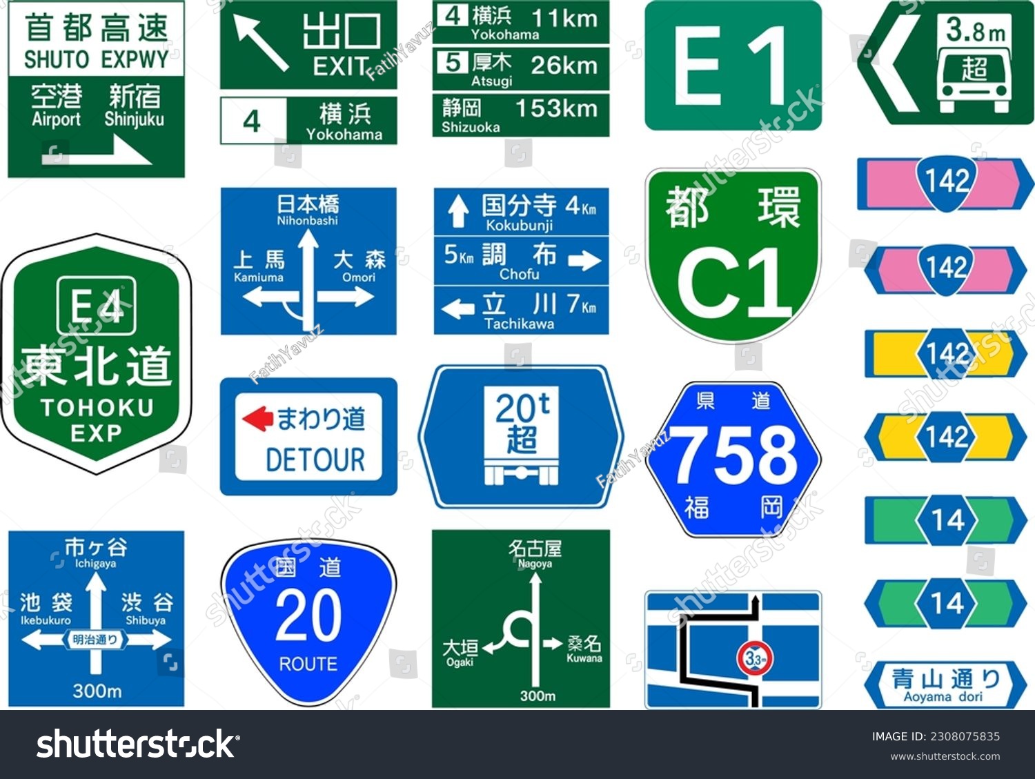
i like the aesthetics of Japanese signs
>>
File: directionSigns1.png (121.3 KB)

121.3 KB PNG
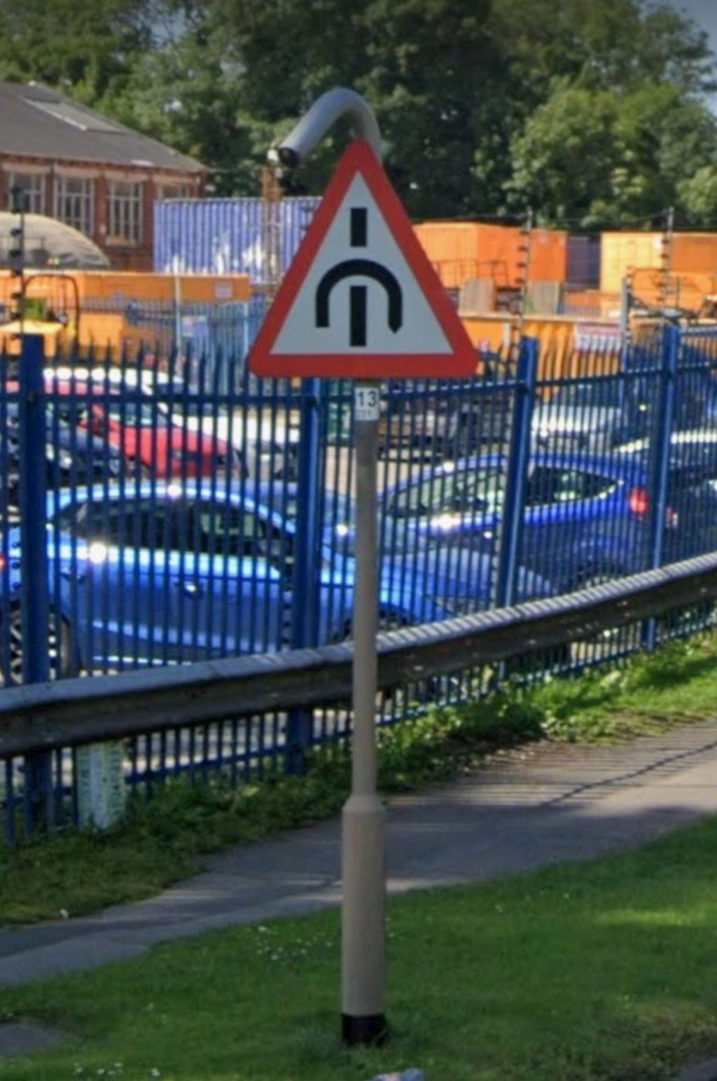
>>2022671
>sliproad loops depicted on the sign
It's shit. British road signs mog literally everyone else.
>>
>>2022126
I think UK wins. The red outlines are too thick on the NL signs, looks out of balance. USA and Aus have too much writing. The only thing UK fails on is not having a red bar through the bike. Never understood this.
>>
File: sign-giving-order-minimum-speed-end.jpg (36.8 KB)

36.8 KB JPG
>>2022713
As the other anon explained, a red circle will always be prohibitive, so a red bar is superfluous.
Pic related is an end of minimum speed sign. The blue background without the red circle indicates an order, so a bar through it means that the order is no longer in effect.
>>
File: sign-giving-order-route-pedal-cycles-only.jpg (38.3 KB)
38.3 KB JPG
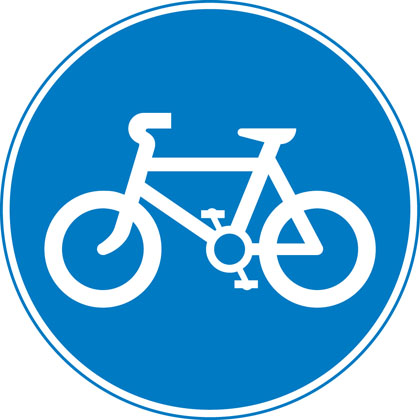
The opposite of the red circle bicycle sign is the one without the red circle and with a blue background, meaning that only bicycles may proceed.
>>
>>
>>
>>

>>2022788
no, too much text, especially for the warning sigs
speaking of warning signs, white or yellow?
>>
>>
>>2022794
that's because, if you want to get technical, circular signs are Orders, whereas triAngulAr signs are wArnings. thus, a speed limit sign, like 'no entry' and 'bikes only' is an order, so they're a circle. 'look out for kids' and 'give way' are warning you that unpredictable small humans are around, and that you don't have right of way, respectively.
>>
>>
>>
>>2022808
>a permissive order (i.e. do X)
that's because circular signs, per the Highway Code, are mostly prohibitive, not permissive:
>https://www.gov.uk/guidance/the-highway-code/traffic-signs#:~:text=Si gns%20with%20red%20circles%20are%20 mostly%20prohibitive.%20Plates%20be low%20signs%20qualify%20their%20mes sage.
>>

For me it's Finnish ones.
The yellow color and thick outline especially are appreciated in snowy conditions.
>>
>>2022829
>i say that a red circle will always be prohibitive on a post explaining that only a blue circle is permissive
>anon says that circles are generally permissive
>i bring up examples where this is not the case
>you bring up some fact that I had already posted
>i ask how your post backs up the other post about how circles are generally permissive
>you bring up the red circle example as a counterpoint to that other anon's post, which is what i was originally talking about
Why don't you follow the conversation first before replying to it?
>>
>>
>>
File: 0_Ctm_OdpdFECtzcYa.png (13.9 KB)
13.9 KB PNG
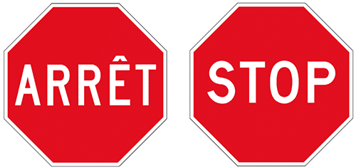
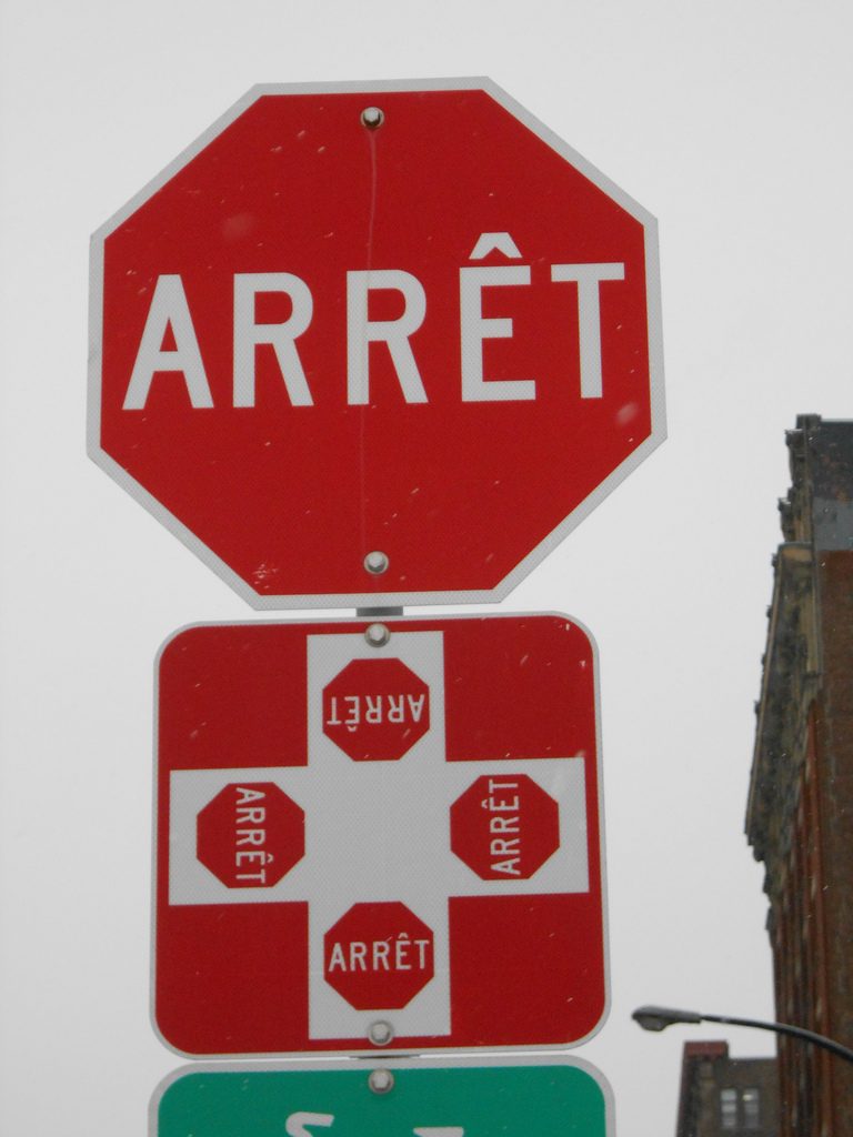
I find it hilarious that Quebec has stop signs that say "ARRET" but stop signs in France say "STOP"
what cucks
>>
>>2022946
I don't, that's precisely why I differentiate between "anon" and "you" in my previous post.
Your posts are also a lot more formulaic than you think, that and your lack of consideration for context leads me to believe that you're a bot.
>>
File: téléchargement (3).jpg (75.5 KB)

75.5 KB JPG
Having road signs with text is not a good idea imo. Signs like that should have simple symbology so that they can be understood regardless of your language and require no translations.
>>
File: file.png (295 KB)

295 KB PNG
What were they cooking when they designed Philadelphia's street signs?
>6-sided
>lists address block numbers in both directions (also was very first city to display block numbers)
>puts cardinal designation of street in its own space
>has optional space on the bottom to list any additional information (street name changes or no outlet ahead, arterial/route designation, honorary/secondary names, etc)
>>
File: vertical-form.png (19.2 KB)

19.2 KB PNG
Japanese, Chinese and similar languages have an advantage because their text comes naturally in a top-to-bottom orientation
This could come in useful if you want to display the street name straight ahead at an intersection
IDK if they actually use it that way
>>
does your country have any rare or unique road signs?
>>
File: taiwan.jpg (76 KB)

76 KB JPG
>>2023017
I've seen vertical direction signs in Taiwan but I don't think they're utilised in China and Japan. I don't think they'd be particularly useful since you'd know the name of the road when you turn onto it at an intersection.
>>

>>
File: level crossing.jpg (4.7 KB)
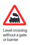
4.7 KB JPG
>>2023041
We're probably the only country where level crossing signs still depict a steam train, since the UK stopped using steam trains in 1968 whereas our current signage design was introduced in 1965.
>>
>>
File: 49e42szkoly_okolice.jpg (339.4 KB)

339.4 KB JPG
>>2023041
I think the lollipop sign is unique to Poland
>>
File: Zebra_crossing.jpg (61.5 KB)

61.5 KB JPG
>>2023054
I'm surprised because a lot of those countries would've stopped using steam by the time those signs were introduced.
The page you've linked does show a pedestrian crossing warning sign for the UK, but it's not something I see often, probably because the flashing lights are visible enough.
>>
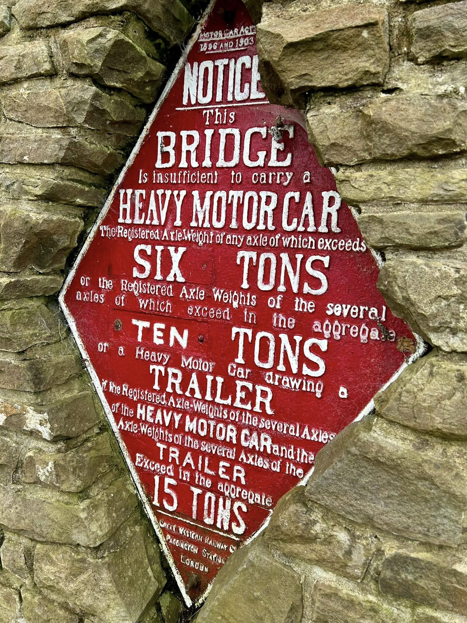
File: bridge.jpg (11.1 KB)
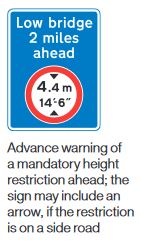
11.1 KB JPG
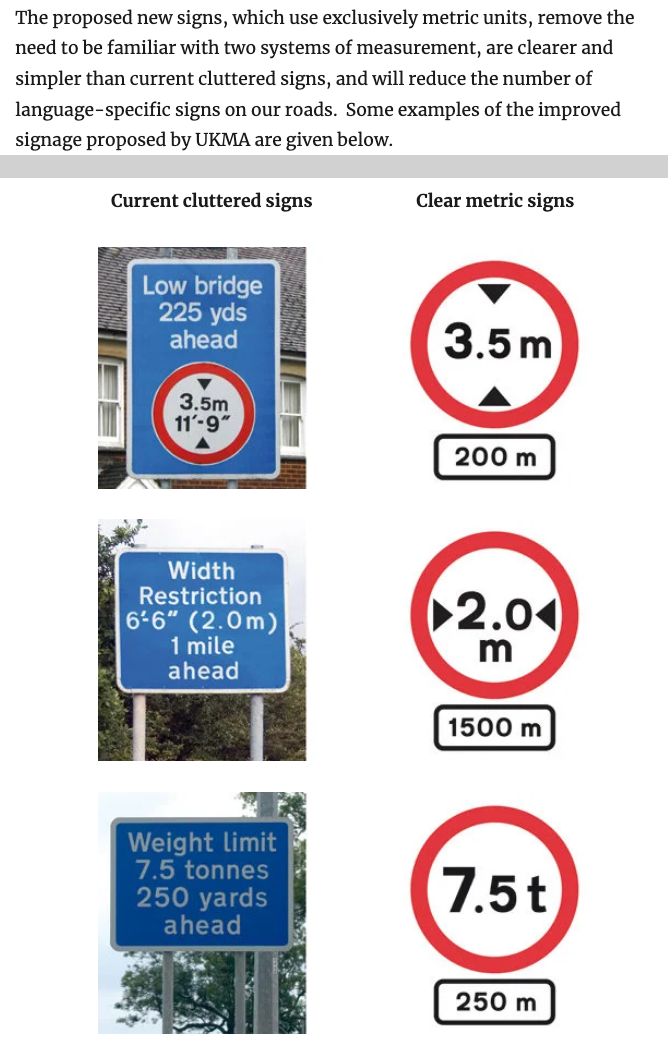
Anyway height and width restrictions in the UK are always shown in both metric and imperial units. I'm not sure if there's another country that does the same thing.
>>
>>
File: Zeichen_151_-_Bahnübergang,_StVO_2013.svg.png (46.3 KB)
46.3 KB PNG
>>2023061
Still, the German EMU design looks distinctive enough and wouldn't look out of place in the 60s either.
>>
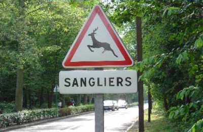
>>2023049
I can't say I've seen anything but the deer before.
>>
>>
File: maxresdefault (2).jpg (180 KB)
180 KB JPG
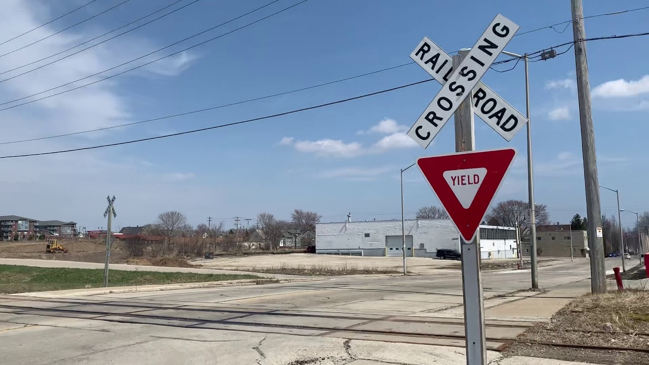
>>2023041
we had to start adding "yield" to railroad signs because people couldn't figure out the train doesn't stop for you
>>
File: unnamed.gif (18.3 KB)
18.3 KB GIF
>>2023041
Do other countries have Amish?
>>
File: images.jpg (4.6 KB)
4.6 KB JPG
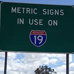
>>2023041
>>2023049
We have signs that warn drivers they may encounter the metric system
>>
File: rtjzuikledth.png (15.9 KB)
15.9 KB PNG
>>2022126
They are important
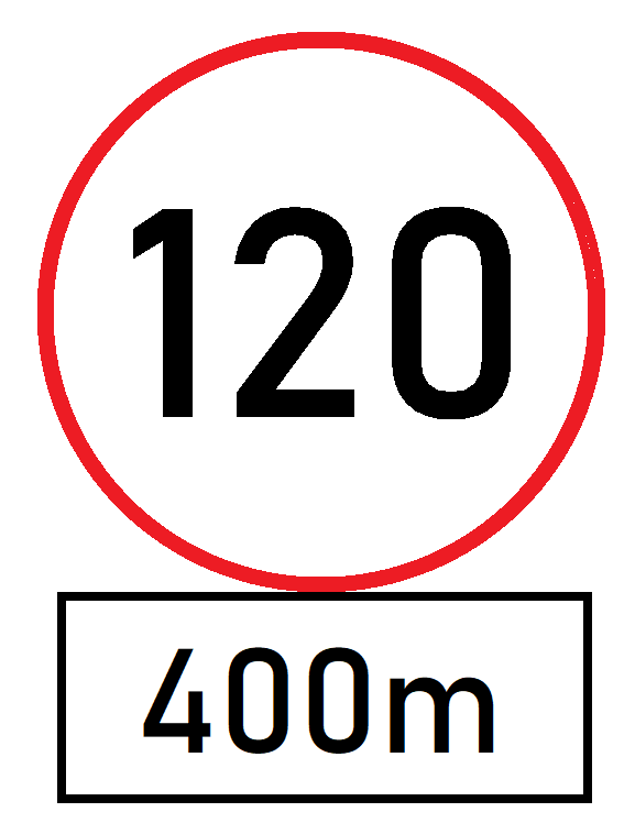
Germany
No, but in Germany, speed limits should be announced following an unlimited section, like pic related. It would give drivers a better idea of when to brake and also to just let it roll instead of actively braking.
>>
>>
>>
>>2023184
You're wrong. I got that image from the highway code traffic signs page itself.
>https://www.gov.uk/guidance/the-highway-code/traffic-signs
>Route to be used by pedal cycles only
All you have to do is remember that blue circle = permissive, red circle = prohibitive.
>>
File: images.jpg (14.8 KB)

14.8 KB JPG
>>2023223
Japanese spotted
>>
>>
>>2023304
I suppose the French sign is fundamentally the same as the British sign in the sense that they can both be reduced down to
>if you are using this lane, you must use a bicycle
but the French sign adds an extra prohibitive order forbidding you from using the adjacent road.
>>
>>2022792
>Dicks hang right
>Dicks hang left
>Go forward, take a right because you thought this was the turn, but it's actually a block up
>Same thing, but to the left
>Here there be treasure
>Stick your arms out and pretend you're an airplane
>Oh no you lost a wing
>Oh no you lost the other wing instead
>I think someone's gonna try to merge on the right
>Nope fucker's coming from the left
>Recycle
>You should consider a picket fence around your yard
>Choo choo
>Why not stop and enjoy an Almond Joy?
>Sick jump ahead
>The transit planner was hungover when drafting these road
>Right lane ends
>Left lane ends
>Sick jump over water ahead
>Don't forget to scoop the cat poop from the litterbox when you get home
>88mph to engage the flux capacitor
>Bowling pins ahead
>Smaller bowling pins ahead
>Free beef
>Free venison
>Yo check out the wind sock
>I can't remember the Konami code, someone please stop and help me
>You're about to get stuck behind a trolley
>Time to save gas and fuck up your breaks
>Time to burn gas
>Douchebags around
>This is a good place to smash your car and get an insurance payout
>This water feature doesn't have a sick jump
>Your car drank a red bull now it has wings
>Stoplight
>They found you, Snake!
>Here there be Elsa
>Your car will have many happy children
>Your car needs a nap
>Planned Boeing crash site ahead
>Drive on the shoulder rumble strips
>Drive on the wrong shoulder's rumble strips
>Look upside down ahead.
>>
>>
File: IMG_0176.jpg (221.5 KB)

221.5 KB JPG
>roadsign erected on all of /n/ streets
>>
File: images.png (4.9 KB)

4.9 KB PNG
>>2023518
The loop itself is a waste of space on the sign and is simply superfluous information that has to be processed by the driver.
If you're talking about lanes, then pic related actually states explicitly what lane you need to be on for your destination, which the Japanese example fails to do.
>>
>>
>>
>>
>>
File: SRC-9-1320x854.jpg (266.7 KB)

266.7 KB JPG
>>2023575
Pic is a real thing here.
People know what a steam train looks like. Modern trains at the pictogram level may as well be a representation of an Amazon delivery van.
>>
>>
>>
>>2022126
From this? Definitely USA and Australia.
Also, I'm pretty sure the signs in Australia say "Yield" not "Give way"
>too much writing
So fucking what? They're all still recognisable at a glance even if you can't read at all, and now also self-explanatory. Note the yellow alert signs for bicycles and retarded children, eurobros just slap a triangle with a red border like it's banning children or something.
>>
>>2022884
What do all these fucking euro signs with blue and random crosses mean? At least an American or Australian sign writes what it means. Some of them are even retarded enough to write on it anyway, but still don't say what law applies in this "zone". WTF.
>>2022988
very based
>>2023550
Actually don't think there are any round signs in Aus either -- speed limit signs are in red circles but they're still put on a white rectangular background
>>
>>
>>
>>
>>
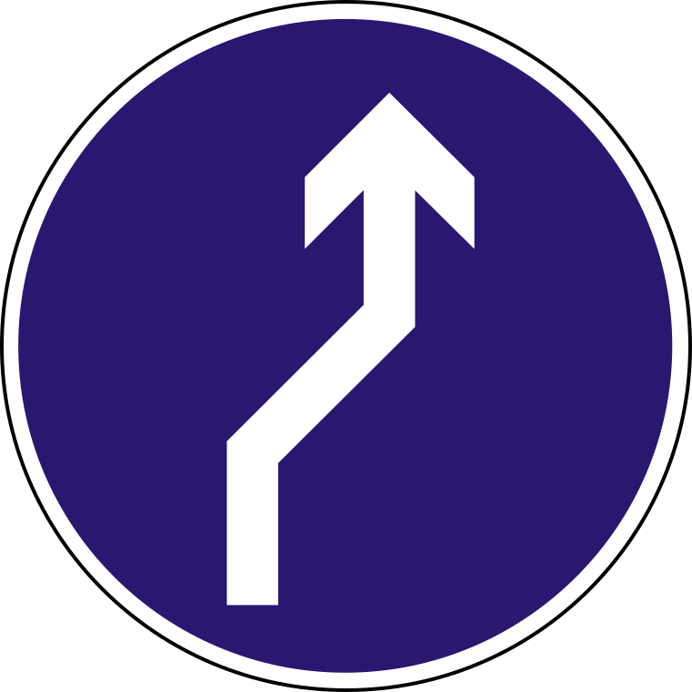
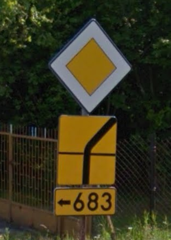
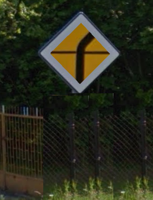
>>2022719
No, the vienna convention works like this
>White circles with red outline: prohibitive (e.g. speed limits, no parking, no overtaking etc)
>Blue circles: commands (e.g. minimum speed limits)
>Triangles point upwards: hazards
>Triangle point downwards: give way
>Octogon: stop
>Rectangles: directions and information
Stop and give way are distinct shapes to make sure you can tell what they are even if snowed/iced over.
>>
>>
>>
File: 1720040636237.jpg (173.1 KB)

173.1 KB JPG
>>2022126
Portugal
btw, we use yellow background, instead of white, for temporary signs (roadworks, etc.), including horizontal markings.
>>
>>
>>
File: 7b64ad45c1d1ae32d6654f9378b70778.jpg (81.1 KB)

81.1 KB JPG
I hate how "turn left/right before the sign" and "keep left/right" look the same"
Even more so because it's a circular sign and can easily be mounted wrong or easily skewed and you wouldn't even know
>>
File: ZOO_balise-reflex-type-j5-02.jpg (188.9 KB)
188.9 KB JPG
this is what the french use. interesting
>>
File: Hungary_road_sign_D-006.svg.png (47.8 KB)
47.8 KB PNG
this one is apparently "Mandatory passage straight to the right" as opposed to the more typical "Pass sign on the left side"
idk the difference
>>
>>
>>
File: hc 1978 26 001.jpg (710.3 KB)

710.3 KB JPG
I was oddly surprised reading the 1978 Highway Code (UK) how pretty much the same it is today; not much changed. I thought, for example, the minimum speed limit sign was a modern thing.
>>
File: hc 1978 27 001.jpg (717.1 KB)

717.1 KB JPG
>>2027885
>>
>>
>>
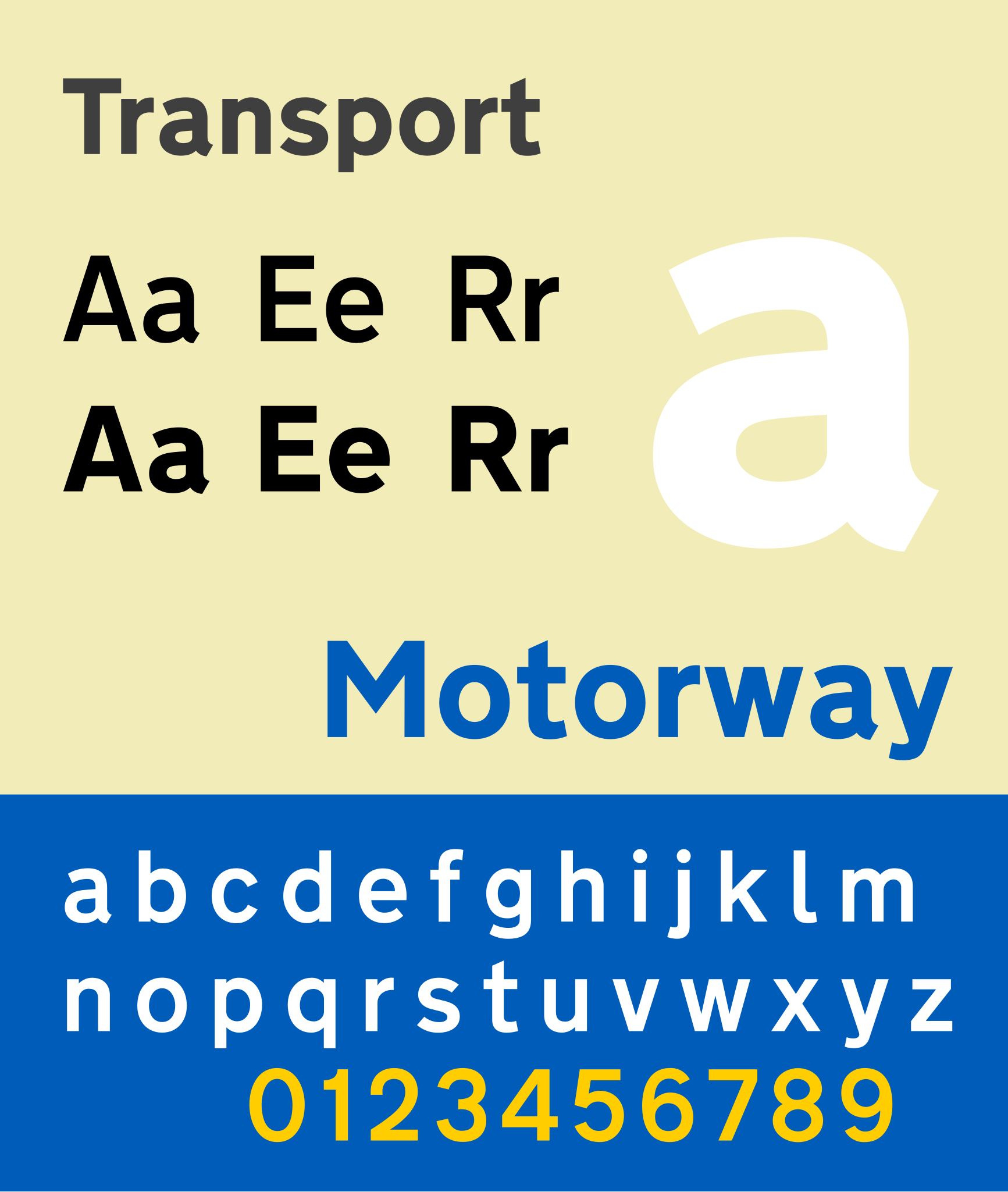
>>2027916
Fonty fact
Transport is a sans serif typeface first designed for road signs in the United Kingdom. It was created between 1957 and 1963 by Jock Kinneir and Margaret Calvert as part of their work as designers for the Department of Transport's Anderson and Worboys committees.
Don't let them touch that stuff they'd mess with the font.
>>
File: Vanha1.jpg (21.7 KB)
21.7 KB JPG
>>2025995
>It's like the floppy pictogram as save.
Speaking of: "attention - art photography!"
This sign has seen some fluctuation in color. The new ones are blue now, meaning "instructional"; yellow is used in prohibitive signs but squares are mostly reserved for extra plates under the main sign.
>>
File: proxy-image (32).jpg (1.5 MB)

1.5 MB JPG
>>
>>
>>2027989
I wanted to contrast how the Greenlanders, who all speak Greenlandic, use a normal stop sign. while in Nunavut they use non standard stop signs. But due to superior Danish traffic engineering, and lack of country roads, I can't find a single stop sign in Greenland on Google maps. Just yield signs and roundabouts.
>>
File: stopsign.png (437.4 KB)
437.4 KB PNG
>>2028041
>found one near a research station
wtf Greenland
>>

>>
File: Łódź Pojezierska.png (2 MB)

2 MB PNG
now take a look at these lane indicator signs. what do you think is the best solution?
poland: only your direction shown, not the cars going the other way (here's it shows a bike lane but would also indicate turn lanes in other places)
>>
>>
File: Erd Budai.png (1.9 MB)
1.9 MB PNG
welp I was gonna post hungary because they showed the opposite direction's lane with arrow in the same direction and a no entry sign covering. but must have been a one off thing.
>>
File: image1.jpg (1.4 MB)

1.4 MB JPG
>>
File: RAW_IMAGE.jpg (188.7 KB)

188.7 KB JPG
>>2028144
>>
File: IMG_3101.jpg (87.2 KB)

87.2 KB JPG
>>2028041
They have a sign for almost every endemic language in Canada
>>
>>
>>
>>
File: standard_compressed_208_0.jpg (82.8 KB)

82.8 KB JPG
When you actually yield for people and they give you the flouride stare.
>>
>>

>>
File: téléchargement (34).jpg (43.1 KB)

43.1 KB JPG
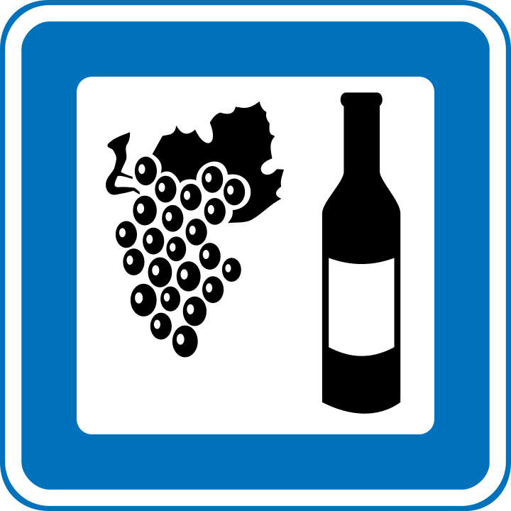
>>2029357
Our vineyard/winery signs are usually just grapes on a burgundy sign
>>
File: Transport_font.png (183.1 KB)
183.1 KB PNG
Which country has the best font?
>>
>>
>>
>>
>>
>>
>>
>>
>>
>>
File: 720px-Denmark_road_sign_m144.svg.png (46.2 KB)
46.2 KB PNG
>>2029361
same as here then, just instead of a burgundy sign it uses the standard blue "service sign" template
>>
File: 5102493516_1640318909_b.jpg (170 KB)

170 KB JPG
Always was a fan of the "Elephants this way" sign we have in the UK
Also, do any other countries have these goofy residential zone signs with the asymetric squares for windows and doors?
>>
File: road-signs-singapore.jpg (202.6 KB)

202.6 KB JPG
Based Singapore signs.
>>
>>
File: China_road_sign_示_9.svg.png (73.2 KB)
73.2 KB PNG
I with my country would have this Chinese road sign
>>
That's also neat.
>>
File: z27265489IH,Przykladowe-znaki-T-6.jpg (71.1 KB)
71.1 KB JPG
Those chinese signs while neat just show the layout, In most countries you'd have instead signs that show priority roads instead. But idk maybe they use multiple signs too
>>
>>
File: GgygZvxWsAArAhv.jpg (172.2 KB)
172.2 KB JPG
not a legal sign, but I wonder how you could do it better. the road splits before the tower ahead
>>
>>
File: Gdańsk Podwale Grodzkie.png (1.2 MB)

1.2 MB PNG
>>2030222
Sure but using only actual signs allowed in your country? And not looking like someone was drunk when placing the straight arrows
>>
>>
>>
File: 0_0_productGfx_a1bc8191a45377371f8339f62fdd80ea.png (47.5 KB)
47.5 KB PNG
>>2030222
>>2030200
The reason it's a problem is that the arrow pointing to a top corner signifies the lane is about to merge into another one. Here they used something that can be confused for both that and a straight ahead arrow which is terrible design
>>
File: Gg1KP29XMAAtRef.jpg (198.6 KB)

198.6 KB JPG
>>2030730
>>2030200
Here's a much more unambiguous design.
>>
File: Finland_road_sign_232_(1957–1971).svg.png (27.1 KB)

27.1 KB PNG
>>2028042
TIL: There exists a Vianna convention round stop sign.
This abomination was in use for 14 years in Finland before the international design won.
>_warning_ orange background
>no text, universal pictogram instead
>either triangular, circular or octagonal; which ever you choose
>>
File: strange-loop.jpg (177.4 KB)
177.4 KB JPG
>>2023041
>Weird signs
Took me ages to work out what this one meant.
>>
File: 20210620_214216.jpg (71.7 KB)
71.7 KB JPG
>>2022126
The US invented road signage standards, fuck europe.
>>
File: RanskaMerkki2.jpg (48.8 KB)
48.8 KB JPG
>>
File: f_new03.gif (106.3 KB)

106.3 KB GIF
>>2023495
>Recycle
>>
>>
File: hook_turn.jpg (48.3 KB)
48.3 KB JPG
>>
>>
File: istockphoto-175691003-612x612.jpg (25.3 KB)

25.3 KB JPG
What's the US equivalent?
>>
>>2025880
>Stop and give way are distinct shapes to make sure you can tell what they are even if snowed/iced over.
Also, you typically have to look for the backs of these signs to know if you have priority in the intersection or not. (Though usually the general road layout makes it clear enough.) Because they are very stingy with these >>2031484 around here.
Like the priority sign is reserved for high speed country roads and never seen in urban environment. The sign tells you that all the intersecting 'carriageways' are to yield. This, even if most of them don't have the fucking yield sign, just a name sign, which is supplied by the road maintainer, that is the sole owner of the road, or like a cooperative with 3 members in it. That you are supposed to yield coming from there because there is a priority road is just 'everyone knows' territory. Besides, the cars are going 100 at the main road and you ar approaching at 30, what are you supposed to do even if you are coming from the right? Many of such places where there is no priority sign yet this is what you do.
>>
Just learned that burgers use stop at literally 90% of intersections. Seems really pointless. You don't need to actually full stop at roads with good visibilty and with no one coming.
In Europe almost all of them would be just yield signs.
>>
>>
>>2033175
>The worst is the 4-way stop.
Why?
>Most of those places would be fine with a hierarchical road structure,
What's that mean?
>or a roundabout
They take up a lot more room than a 4-way stop, driving up the cost. Also terrible for 18 wheelers to get through unless the radius is sufficiently large, which again drives up the cost.
>>
File: I-26_Ukrstanje_puteva_iste_vaznosti.cdr.jpg (93.7 KB)

93.7 KB JPG
>>2033175
>>2033177
4-way stop seems to be the same as an equal intersection in europe. although I assume it's distributed differently
>>
File: China_road_sign_示_6.svg.png (53.1 KB)

53.1 KB PNG
why does my country have this sign but not the opposite, "no turning left and right"
>>
File: p-51774-ahead-only-sign.jpg (9.1 KB)
9.1 KB JPG
>>2034815
>>
>>
>>
File: No turn intersection.png (59.6 KB)

59.6 KB PNG
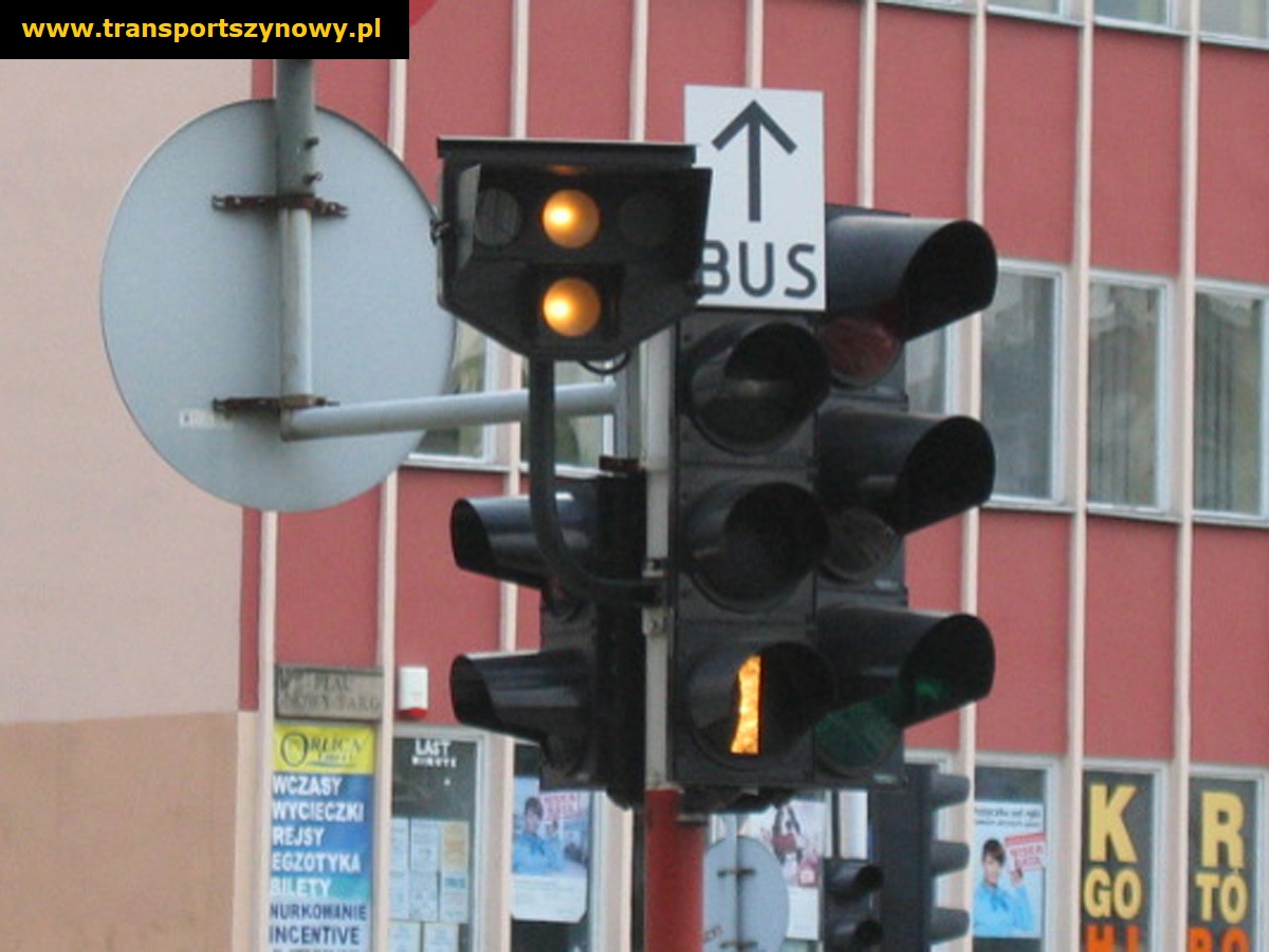
How about rare signal lights?
>>
File: swiss street signs.png (586.2 KB)
586.2 KB PNG
>>2022126
swiss road signs are just better
>>
File: Screenshot from 2025-03-05 20-21-34.png (837.4 KB)

837.4 KB PNG
>>2023041
Hey guys, could you slow down maybe?
>>
File: istockphoto-610224556-612x612.jpg (30.6 KB)

30.6 KB JPG
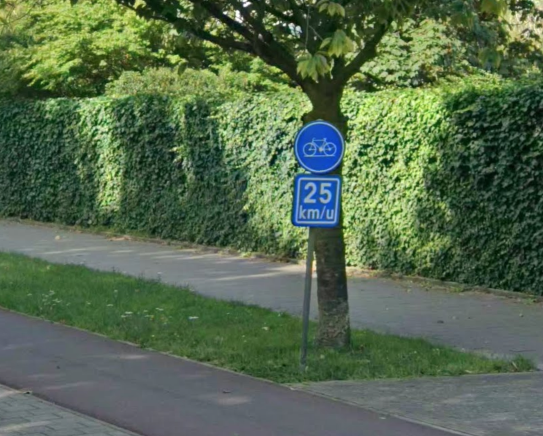
I hate the dutch keep right/left signs
>>
>>
>>
>>
File: Priority sign 2.png (587.7 KB)
587.7 KB PNG
how about something like this instead
>>
File: priority sign 4.png (51.5 KB)
51.5 KB PNG
Or more realistically
>>
File: give way.png (114.8 KB)
114.8 KB PNG
And obviously the other way round which looks more janky due to being inside a triangle, but we manage it with the warning signs
>>

>>2036936
Interstate 68
>>
File: MD68notI68.jpg (1006.9 KB)

1006.9 KB JPG
>>2037141
not to be confused with Maryland Route 68
>>
>>
>>
File: Greek_road_signs,_Pefki,_Attica,_Greece.jpg (977.6 KB)

977.6 KB JPG
Greece has to have the ugliest signs in Europe
They all look hand painted
>>
>>2022142
Circles are commands.
Triangles are warnings
Rectangles are directions and information.
Red circles are prohibitive.- e.g. speed limits, no bicycles
Blue circles are directive - e.g. minimum speed, arrows indicating a direction you must go
>>
>>
>>
File: 1737478289882647.jpg (26.1 KB)

26.1 KB JPG
>>2022126
Signage and road markings should be kept to a minimum, it's a form of visual pollution
>>
File: tfnsw-turning-hook-turn.jpg (15.3 KB)

15.3 KB JPG
>>2023041
behold: the hook turn
>>
>>
File: Australia_road_sign_W9-3-R.svg.png (16.2 KB)

16.2 KB PNG
>>2037131
one sign, same thing
>>
File: Screenshot 2025-05-07 at 07-16-04 D20192311-c1.pdf.png (201.4 KB)
201.4 KB PNG
Official guidelines in my country.
Overkill? 4 signs on each road when you could have just one.
>>
>>
>>
>>

>>
>>
>>
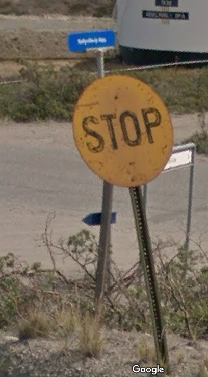
File: stop-sign.jpg (67.4 KB)

67.4 KB JPG
>>2022965
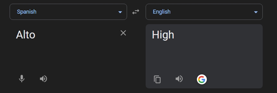
In many parts of Latin America that Stop signs don't even say "Stop" in Spanish or English, they say "Alto" which just means "tall" or "high" because someone fucked up somehow and meant to have the stop signs say "Halto" which means Halt, but they left out the H and now the stop signs don't make any sense in any language and they just kind of accept this.
>>

>>
File: Screenshot 2025-06-15 220547.jpg (90.3 KB)

90.3 KB JPG
>>2029357
The argentines have this abomination, and yes, these are installed by "Vialidad Nacional"
>>
>>
>>
File: Untitled 2.png (184.2 KB)

184.2 KB PNG
It pisses me off how my country has to have a big ass blue billboard for announcing the simple thing of having a danger after a turn on an intersection instead of just having a plaque with an arrow
>>
File: Screenshot_18-6-2025_13125_www.google.com.jpg (32.2 KB)
32.2 KB JPG
>>2044694
>Mexicans move to America and refuse to learn English
>Mexicans live in Mexico and don't even know Spanish
it's all so tiresome
>>
>>
>>
>>2046617
>And if you don't speak the language, that red shape is enough. And you shouldn't be driving if you're colorblind
True, which is why Mexican stop signs would unironically make more sense if there was no words on it at all
>>
File: stop pas.png (89.2 KB)
89.2 KB PNG
Just had an idea. Does any country do this? Imagine if the right turners get their own dedicated merge-in lane so they don't need to stop
>>
>>
>>2046664
but how are those instances marked with road signs
>and you'll find many instances where inersections have dedicated right turn lanes.
well yeah, that's everywhere. what I'm about is the situation where different turns have different priority rules about stopping or just yielding.
>>
>>2046708
>what I'm about is the situation where different turns have different priority rules about stopping or just yielding.
It's common for signaled intersections in the US to have yield signs for right turns rather than requiring a full stop. Usually intersections protected only by signs don't have a dedicated right turn lane in the first place so a yield for such a lane at such an intersection is uncommon.
>>
>>
>>
File: oops! all blindspots!.png (1.4 MB)
1.4 MB PNG
>>2046848
I guess? Knowing the Dutch way of traffic constructions (and their utter haphazardness) it might be confusing for some, but usually I prefer it to not knowing which lane I should keep on things like those giant raised roundabouts in Amersfoort.
>>

in a 2003 international study, this road sign was the least understood
>>
>>
>>
File: state-highway-markers-1712275943.jpg (153.2 KB)

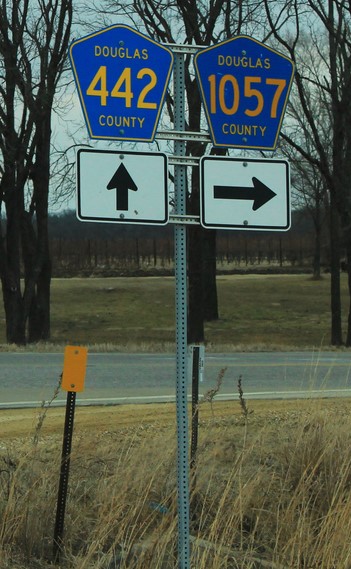
153.2 KB JPG
>>2022126
How do you guys do your route markers? US has the interstate and US highway markers as standard, but state highways are a free for all. Most popular trends are "number in a box" and "number inside an outline of the state".
>>
File: 392-3310_g.jpg (399.1 KB)

399.1 KB JPG
>>2047462
Just a plaque with color and number
but for the lower class roads it has a hidden feature of telling you the axle weight limit that you can tell by looking if the border is black, white or both
>>
>>2022126
UK:
>add "NO ENTRY" to the no entry sign
>make it obvious (because it so often isn't) where the no entry line is by mandating a white line with spikes pointing out in the direction you can't enter from
>add a diagonal bar to the "no (this kind of vehicle)" sign like Australia
all I can think of
we need a new sign for "bike lane ends; give way to cyclists merging in" as well
>>
>>
>>
>>
>>
File: dwsz89-358aa80e-7203-48e4-9dd2-4062a711ee3f.jpg (580.4 KB)

580.4 KB JPG
>>2049624
Alto means tall, it doesn't mean stop. Pare means stop. "Alto" in the context of Mexican stop signs is a poorly rendered version of "Halto"
You can't argue with this Jose, literally every other LatAm country gets this right. Also see >>2045097
>>

>>
File: sinal_sapo.jpg (60.4 KB)

60.4 KB JPG
>>2049661
speaking of Portuguese signs
>>
File: MUTCD_R9-4.svg.png (78.4 KB)

78.4 KB PNG
US has a no hitchhiking sign
>>
>>2049833
There are usually only setup near Federal Prisons so drivers are dissuaded from picking up potential escapees unknowingly
Although I haven't seen any of those signs in literally decades, probably because I don't live anywhere near a federal prison, and also probably because prison escapes are extremely rare to nonexistent nowadays with modern surveilance, which just makes those signs mostly just a formality.
>>

How to show that there's going to be a restriction/prohibition sign ahead or after a turn on an intersection?
>>
File: Screenshot 2025-07-27 at 18-37-08 Traffic Signs Review produces INACTION plan – Metric Views.png (522.2 KB)
522.2 KB PNG
a warning sign doesn't introduce any new rules so we could have just a warning sign with a plaque underneath explaining that's it's x metres ahead or with an arrow like >>2045087
When it comes to prohibition signs I don't think having a sign itself with a plaque is a good idea and most countries don't either. It could be confusing and cause drivers to think the restriction applies immediately
>>
>>
File: restriction ahead poland.png (22.3 KB)

22.3 KB PNG
this is how we currently do it
>>

>>2023041
Glad we still can go 130 km/h on pretty much any highway. Fuck you Austrians and your 100 kmh limit you cucks.
>>
File: k0cHbbpPJHbjrFebAvK3Vw-1800625791.png (14.2 KB)

14.2 KB PNG
>>2049981
>>2049978
You guys overcomplicate things. You just need to put a distance plate below the sign to show in what distance the prescription or warning will apply.
>>

>>2049986
This is considered a warning sign so yes we do it with the yield sign and other warning
But for the reasons I explained it's different with obligation and prohibition signs.
>>
>>
>>
>>

>>

I also like their painted markings in the middle of equal right of way intersections that show you where the other road joins. (The cross and T-shapes)
>>
File: Screenshot from 2025-08-14 21-44-59.png (1.2 MB)
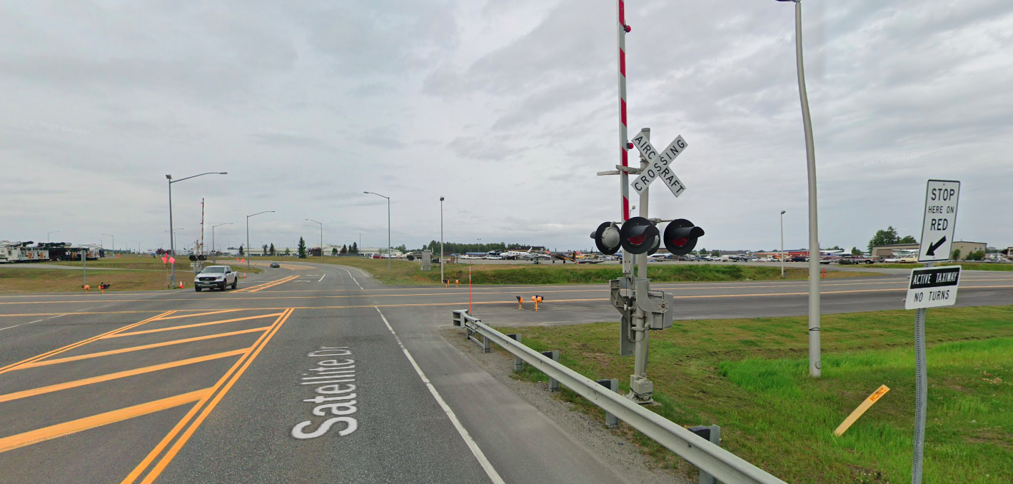
1.2 MB PNG
Aircraft Crossing
>>
File: Evolution-of-road-signs-in-European-country-signatories-of-the-Vienna-Convention-country.jpg (244.8 KB)
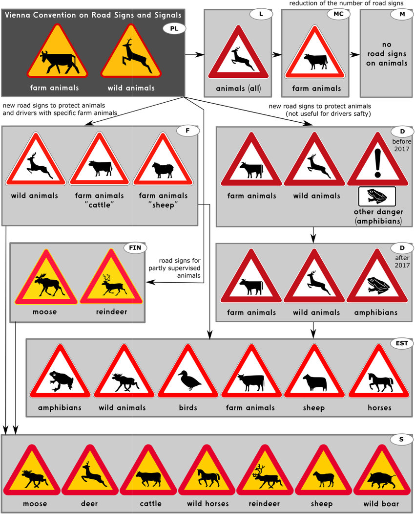
244.8 KB JPG
>tfw no frog sign
>>
>>
>>
>>
File: IMG_1790.jpg (155.7 KB)

155.7 KB JPG
>>2052264
we have them in holland
>>
>>
>>
>>
I wonder if some countries dont use the white blinking light at railway level crossings (meaning the crossing is functional and you can safely go ahead) because they'd be considered too annoying for residents living next to crossing
>>
>>2028044
This. America's color system conveys information quickly. That's real minimalism. Any text is supplementary.
red - prohibition
yellow - warning
orange - construction
white - regulatory info
green/blue/brown - general info
>>
>>
>>
>>2024662
>At least an American or Australian sign writes what it means
In what language? This is the problem for most of europe, there isnt an expectation that everyone speaks every local language, so signage without writing is the correct way to do it
>>
>>
>>2049975
>both measurements systems displayed at once
>you need to know both to understand the sign
am I not getting something or is this some kind of bureaucratic need to spin any possible downsides as upsides? why not just say "everybody will need to know metric but weve been using it long enough that everybody should"?
>>
>>
File: maxresdefault456.jpg (170.9 KB)

170.9 KB JPG
In addition to the standard flashing alternating red lights at the crossing, the US also have yellow advance warning lights.
In a few different configuration it seems, two side by side but also single yellow or one light below the other.
Is it really that necessary?
>>
File: la-raie-stop.jpg (72.8 KB)
72.8 KB JPG
>>2022965
even more based is the sign below them, that tells you if there's any other stops at the intersection. It's so easy to tell if you have the right of way or not.
TOKEBECICITTE
>>
File: SENAL-DE-60-X-60CM-CEDA-EL-PASO.PNG.png (11.4 KB)

11.4 KB PNG
>>2022126
Something that I noticed, similar to "PARE" or "ALTO" debate, is there a "YIELD" v "GIVE WAY" debate?
Sign in Spanish for reference
>>
>>
>>
>>
>>
>>2057321
geoguessr is still superior because they made some changes so it doesn't drop you in the middle of a grainy 2 lane highway that might be siberia or yukon territories or whatever, it's almost always either in a populated area or within 100 clicks of a town of some sort
>>
>>
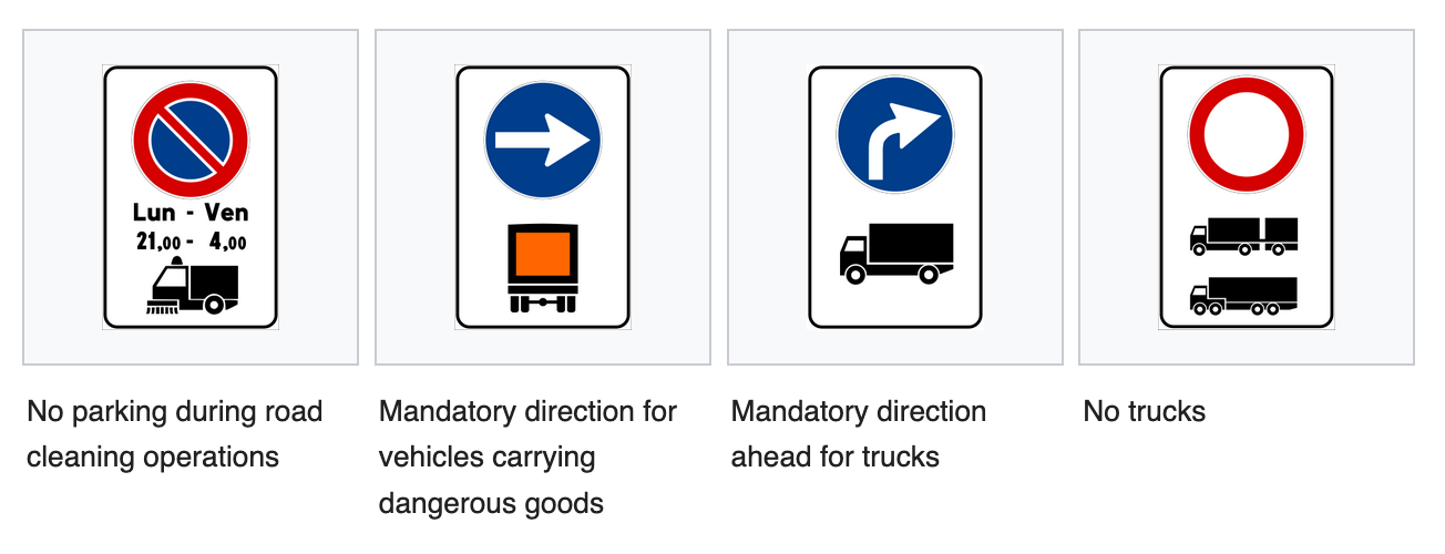
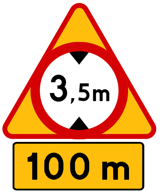
I enjoy how Italy does this instead of having a round sign with a "applies to" plaque beneath. Much more elegant.
For some reason the Vienna convention only specifies the trucks with hazardous material sign.
>>
File: 68 beatrijslaan antwerp.png (1.5 MB)
1.5 MB PNG
advisory speed in km/u (kilometer per uur) instead of km/h. same thing but looks unprofessional
>>
File: 490937518_1518499159299101_6107240627154147582_n.jpg (719.5 KB)
719.5 KB JPG
somehow this design didn't catch on
>>
>>
File: traffic-sign1.jpg (363.6 KB)

363.6 KB JPG
How would you represent exceptions graphically? At the moment every country writes this word with language and as a foreigner you can't always be sure if it says "except" or "applies only to". Annoyingly, some places don't even use symbols for vehicles it applies to, instead using text
>>
>>

>>

>>
File: IMG_0120.jpg (208.1 KB)
208.1 KB JPG
I believe it must be confusing for colorblind people when looking at traffic lights at night
Should we make it easier for them? Tram drivers get shapes instead of colors, top to bottom line means Go, left to right line means Wait
>>
>>
>>
>>
File: Screenshot 2026-01-11 at 16-20-26 Wzory znaków i sygnałów drogowych w Polsce – Wikipedia wolna encyklopedia.png (59.4 KB)

59.4 KB PNG
But one thing for sure, they should stop putting lots of tiny symbols inside a small circle to light up, you can barely tell them apart especially from farther away. don't put 2 arrows in one signal, get 2 separate signals each with its own arrow. or convey the same information with a static sign
>>
File: Karl_Peglau_Proposed_Traffic_Light.png (5.1 KB)

5.1 KB PNG
>>2063072
>I believe it must be confusing for colorblind people when looking at traffic lights at night
Karl Peglau, the Ampelmannchen designer, designed a traffic light that solved this exact problem but it never went anywhere.
>>
>>
>>2047462
Texas has a number inside the state outline, but those are FM roads, a unique sort of state road that can be anything from an urban road to a freeway to a dirt road.
>>2023103
Most of the time railroad signs have lights and gates, you don't need to treat like a yield or slow down/look around (unless legally required to, like a bus or school bus). You almost never see a railroad crossing like that except in either extremely rural areas (like some dirt road that sees less than 20 cars a day), tracks that have virtually no traffic, or industrial spurs. Look at that picture, does that look like a well-used mainline to you?
>>2055831
Helpful when there's actually a train approaching.
>>

>>
File: Alafata.jpg (278 KB)

278 KB JPG
>>2053489
Even the two digit ones make the state too fat but the three digit ones really stretch things out.
>>
Many states use pic related for county roads but a few states have their own design for county roads and a few others don't have any county roads at all.
>>

>>2022126
You can mix and match them in certain situations, like Dubai's "I use UK-style signs, but I really, REALLY love American freeways like they have in Texas".
>>
>>
File: uoPB8q2.jpg (1.5 MB)

1.5 MB JPG
>>2053409
>green/blue/brown - general info
Its actually even more specific than this:
Green - Route info
Blue - Service info (rest stops, lodging, etc)
Brown - Recreations & historical sites
Some states even designate pink for detour information or "incident management". I love American signage!
>>
>>
File: standard.png (1.1 MB)

1.1 MB PNG
>>2063146
I prefer MA, VA, ME and Michigan. They look like real road markers, not something straight out of a cartoon. Having been in both FL and NH, shape-based signs suck. They don't even do the road distance posts right.
>>
>>